Admit it, we’ve all picked up a six-pack or a bottle of wine based on the label. When you’re running late to a party and you don’t want to show up empty-handed, sometimes your last-minute liquor-store decision comes down to one thing: “That looks cool!”
So design matters! The folks at Fernson have their aesthetic dialed in pretty good: Millennial minimalism with a shot of whimsy. And the world has started to take note. The design firm Ceros did a beer can label ranking and put this summer’s Vanilla Milkshake IPA on the list.
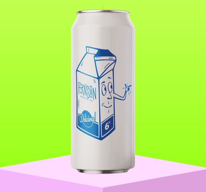
As they report: ““This was one of the few beers this year I bought simply because I wanted the can,” says Mike Schacherer, the creative director and a vice president of Little & Company. Fernson graphic designer Mitch Torbert drew the whimsical milk carton, at home in 1965 or 2021. Says Schacherer, “It’s clean. It’s simple. It describes the beer. And it makes you smile.”
And indeed it does! Our favorite cans will always be the classics: Budweiser, PDR, Miller High LIfe, etc. But if you’re going to break out of the tall-boy pack, it’s good to have some fun with it.
Fernson’s Vanilla Milkshake IPA does that just right, both on the outside of the can…and on the sudsy inside too.
Get out and grab a sixer before they’re gone!